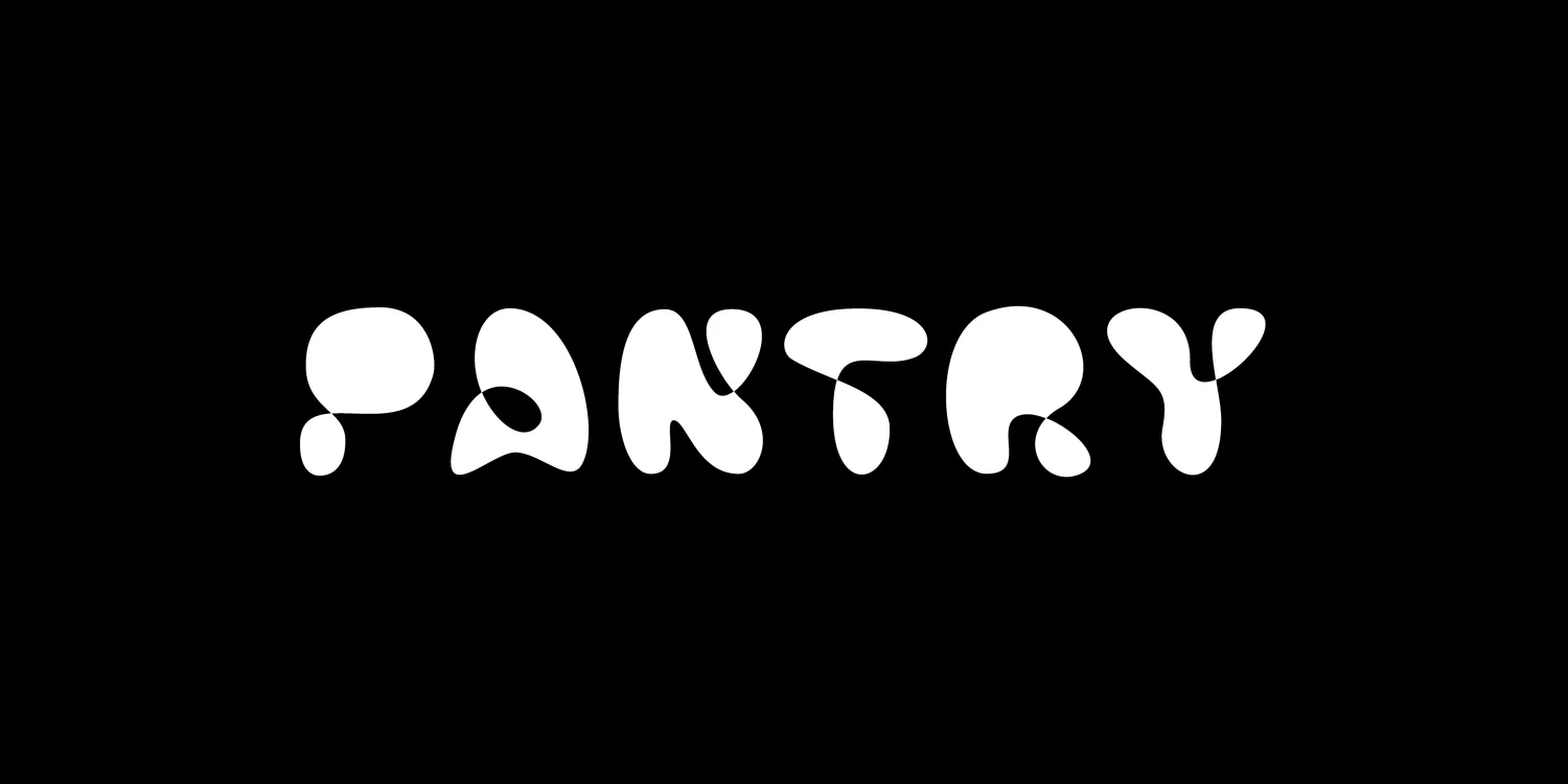
OverviewDurning early workshops at the Letterform Archive I developed this experimental display typeface. Can a typeface be made with a single line that flips and folds to create negative and positive space. The answer, a resounding yes. This concept allows for movement from more traditional letterforms into a high contrast version. The animation shows the liquid nature of the simplified letterforms.
About
Michael Stark is a designer focused on brands and typography, working across identities, visual systems, and cultural projects. His practice connects concept development with execution, shaping ideas into cohesive design. He earned his design degree at San Francisco State University and continued his education, earning a Certificate in Type Design from Letterform Archive in San Francisco. He has since worked with brands including Herman Miller, Everlane, and Apple.
His experience ranges from supporting international brands to launching new ventures. Across branding, typography, and art direction, he has both led projects and contributed within larger teams, turning ambitious ideas into clear, distinctive work.
Michael approaches design with an eye toward what comes next—and what should endure. He builds on a brand’s core principles while finding room for it to evolve with new technologies, audiences, and contexts. The aim is work with a strong point of view and a lasting purpose: adaptable systems that remain recognizable and relevant over time.
Editorial Design
Art & Creative Direction Book Design Editorial Design Print Production