Freakish
Year2019
Role & CreditsTypeface Design
Education & Guidance
Final certificate project at Letterform Archive, San Francisco, under James Edmondson of OH no Type Co
Education & Guidance
Final certificate project at Letterform Archive, San Francisco, under James Edmondson of OH no Type Co
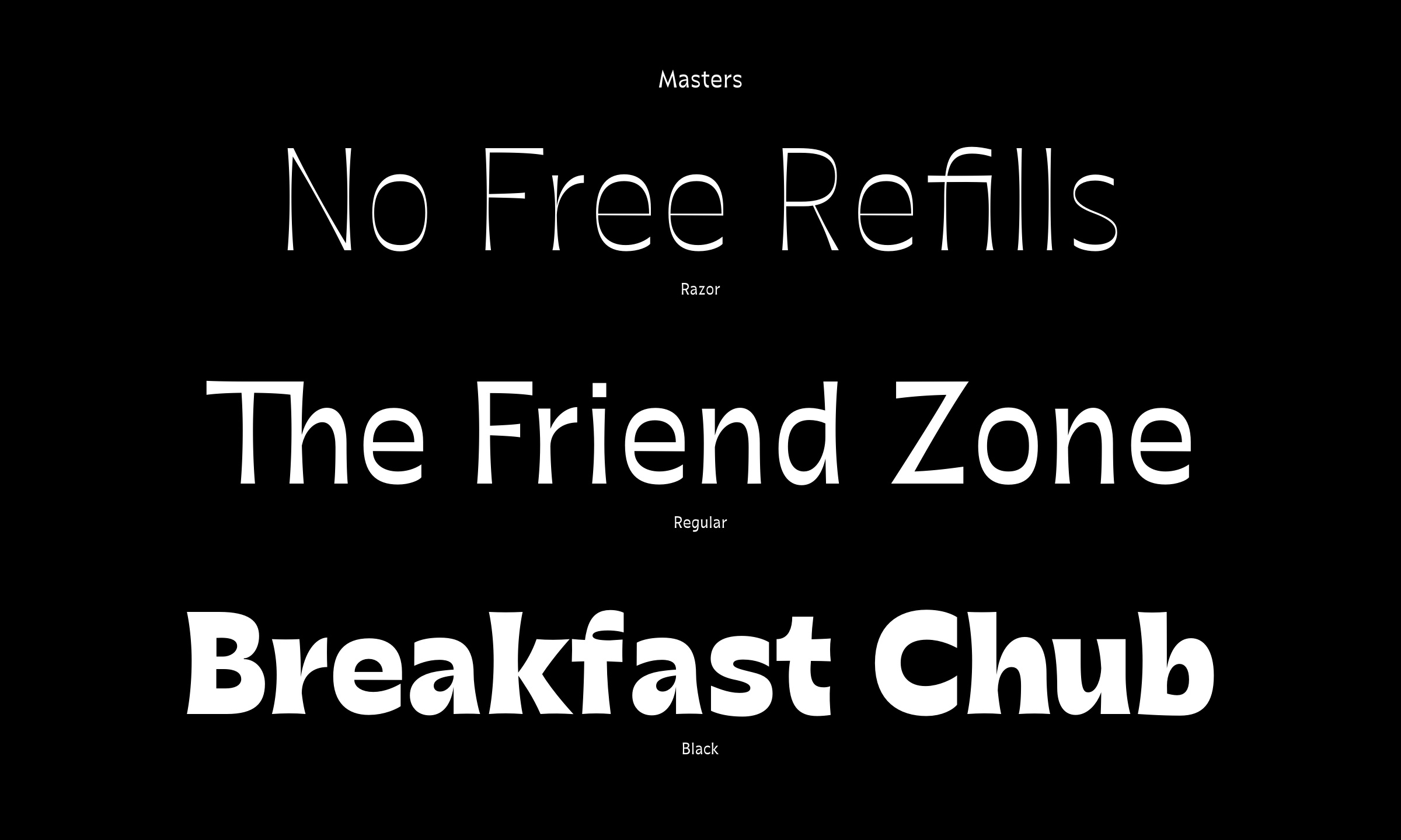
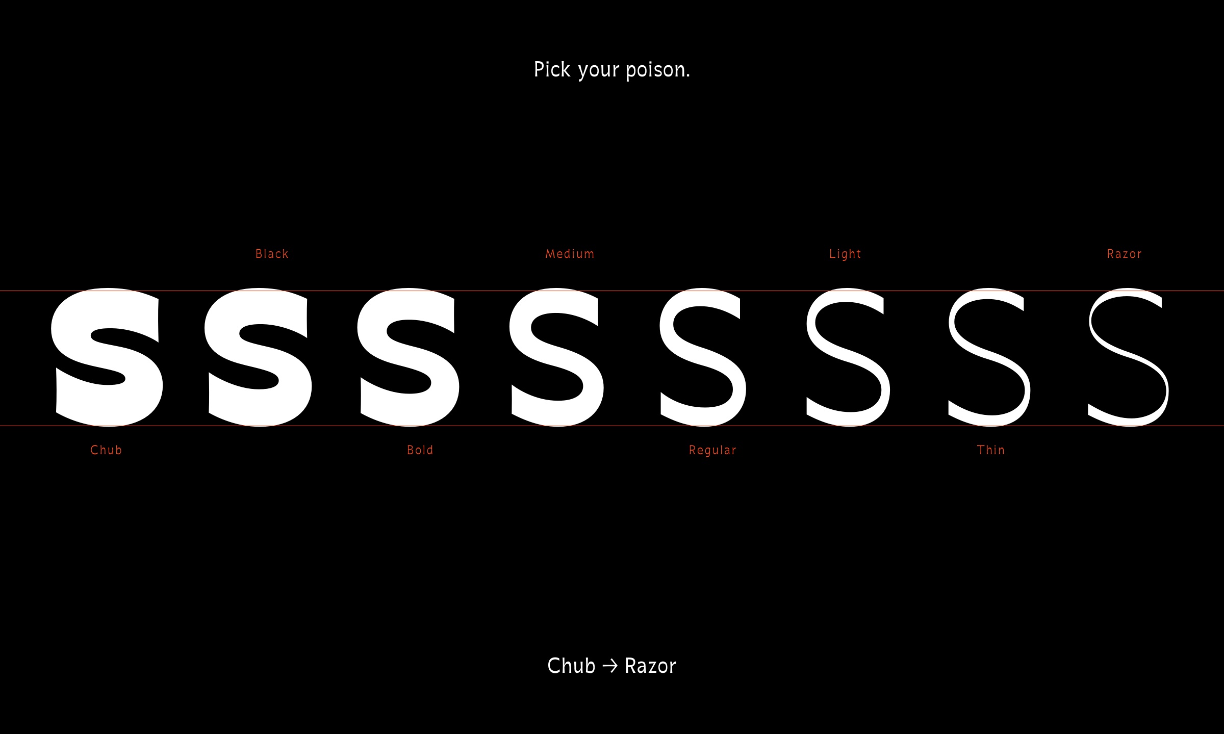
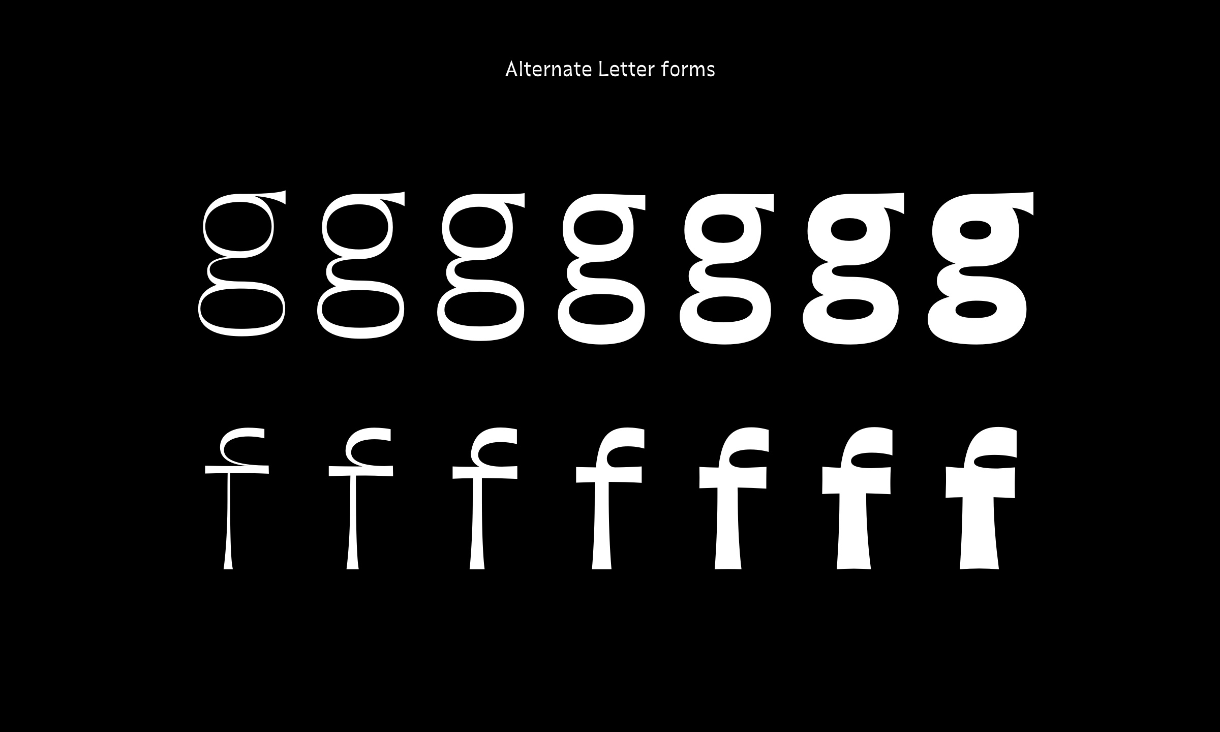
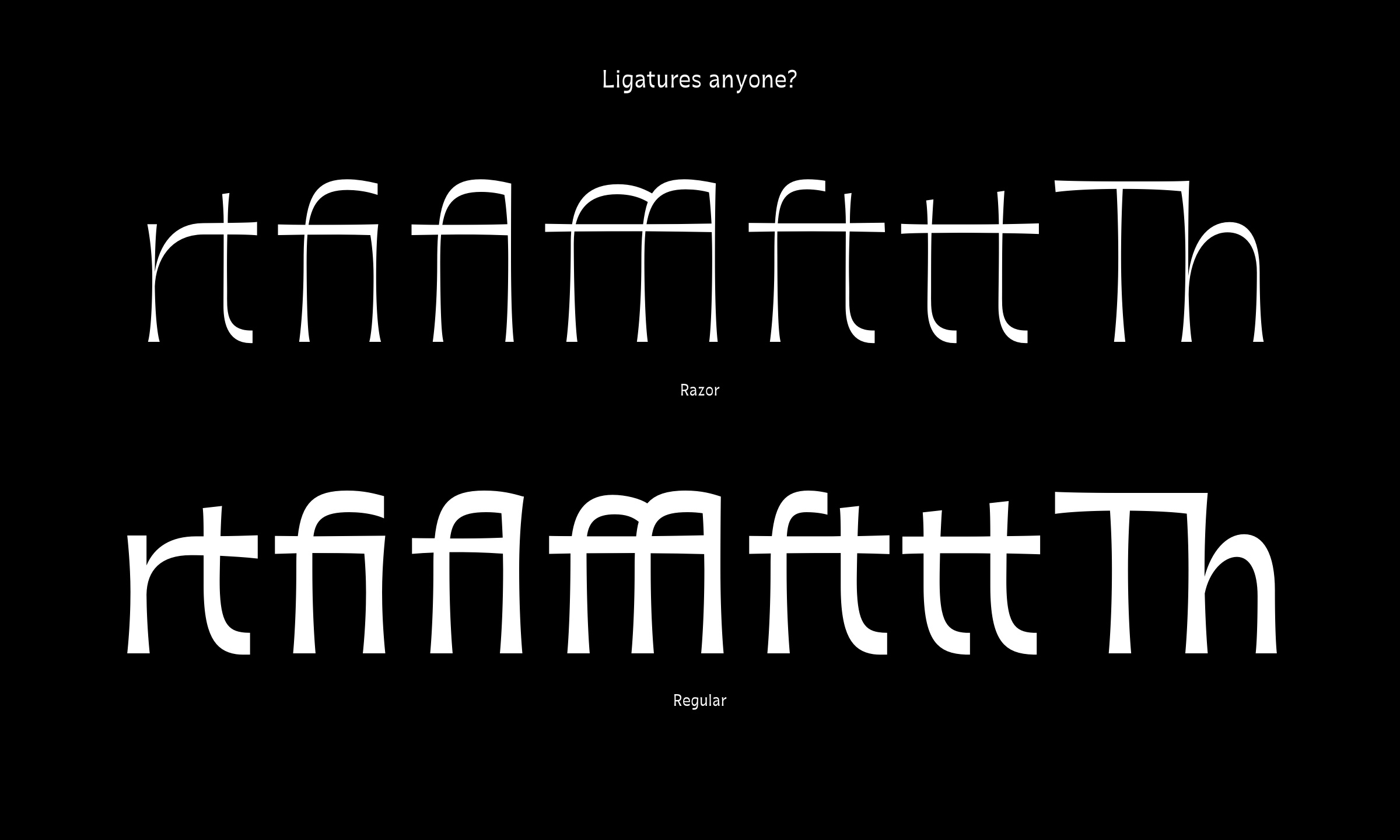
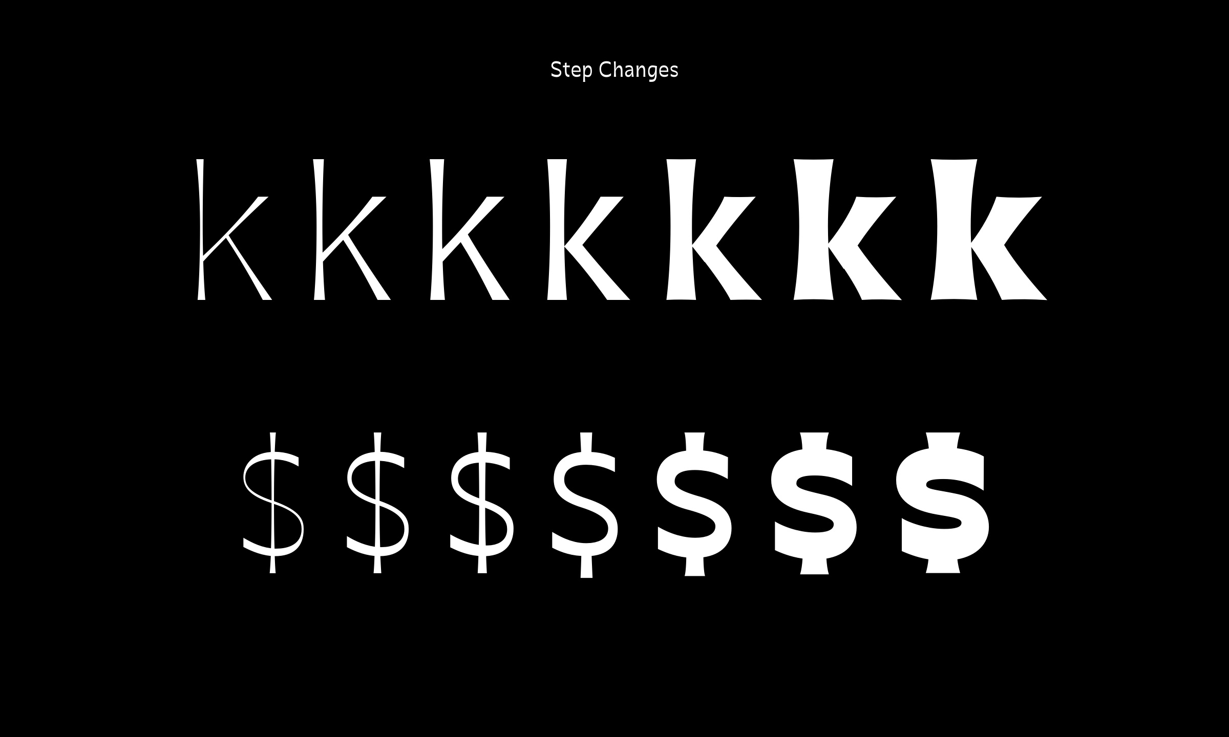
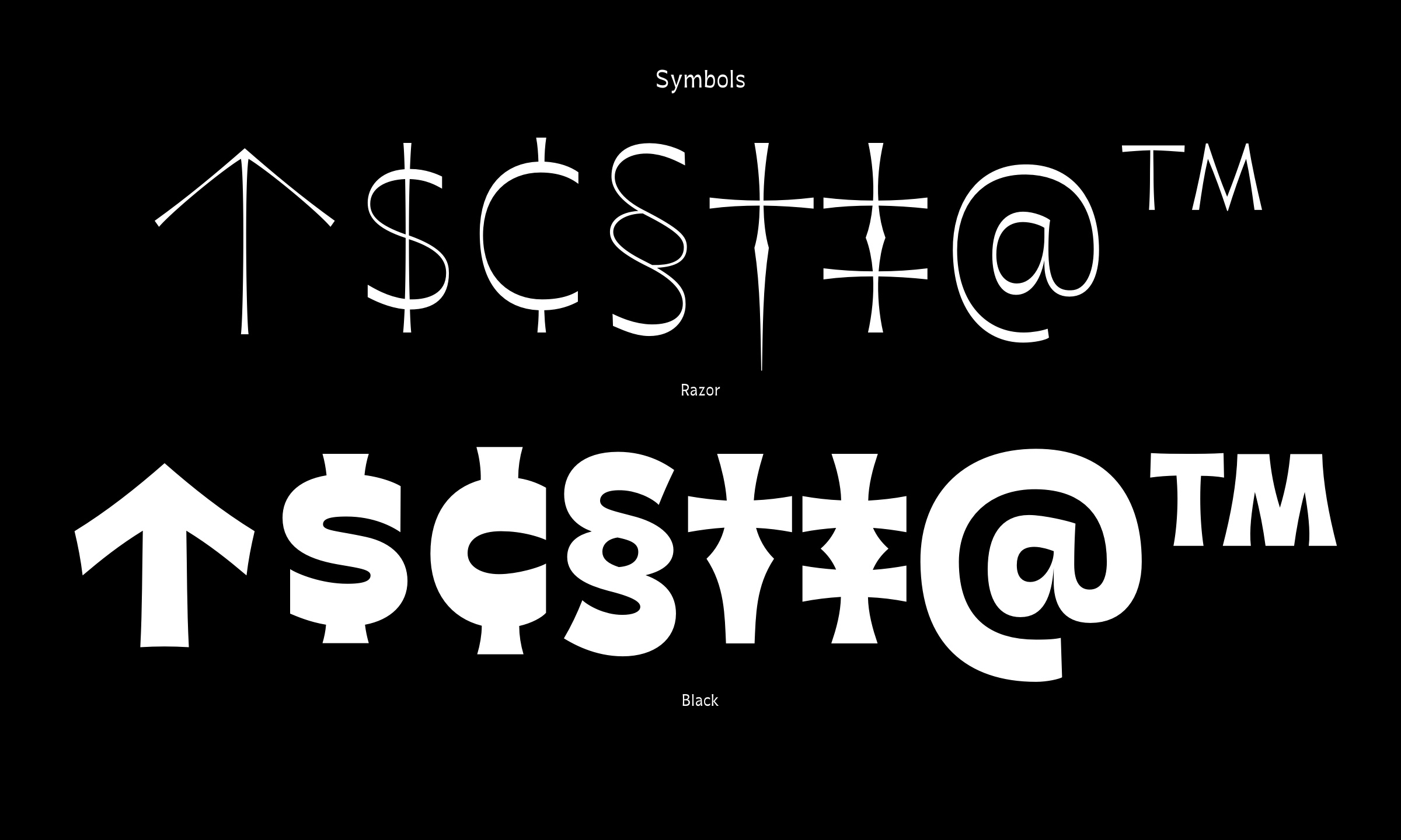
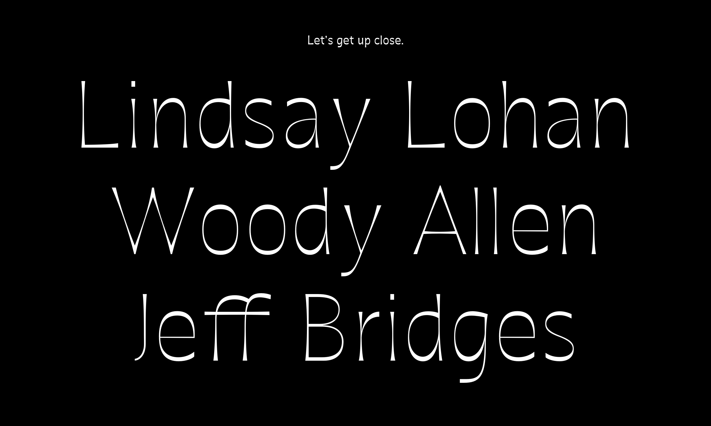
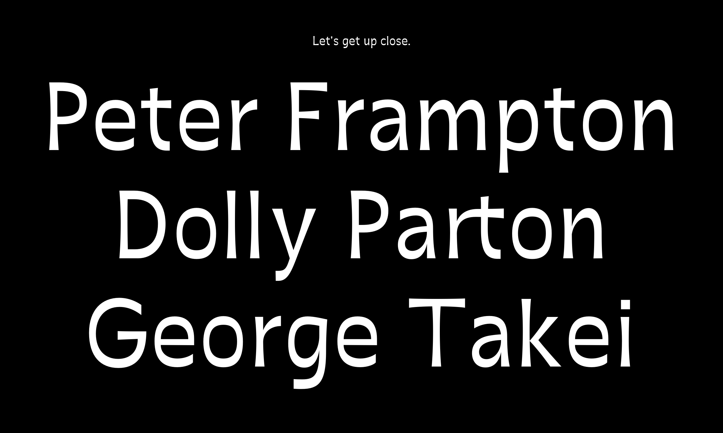
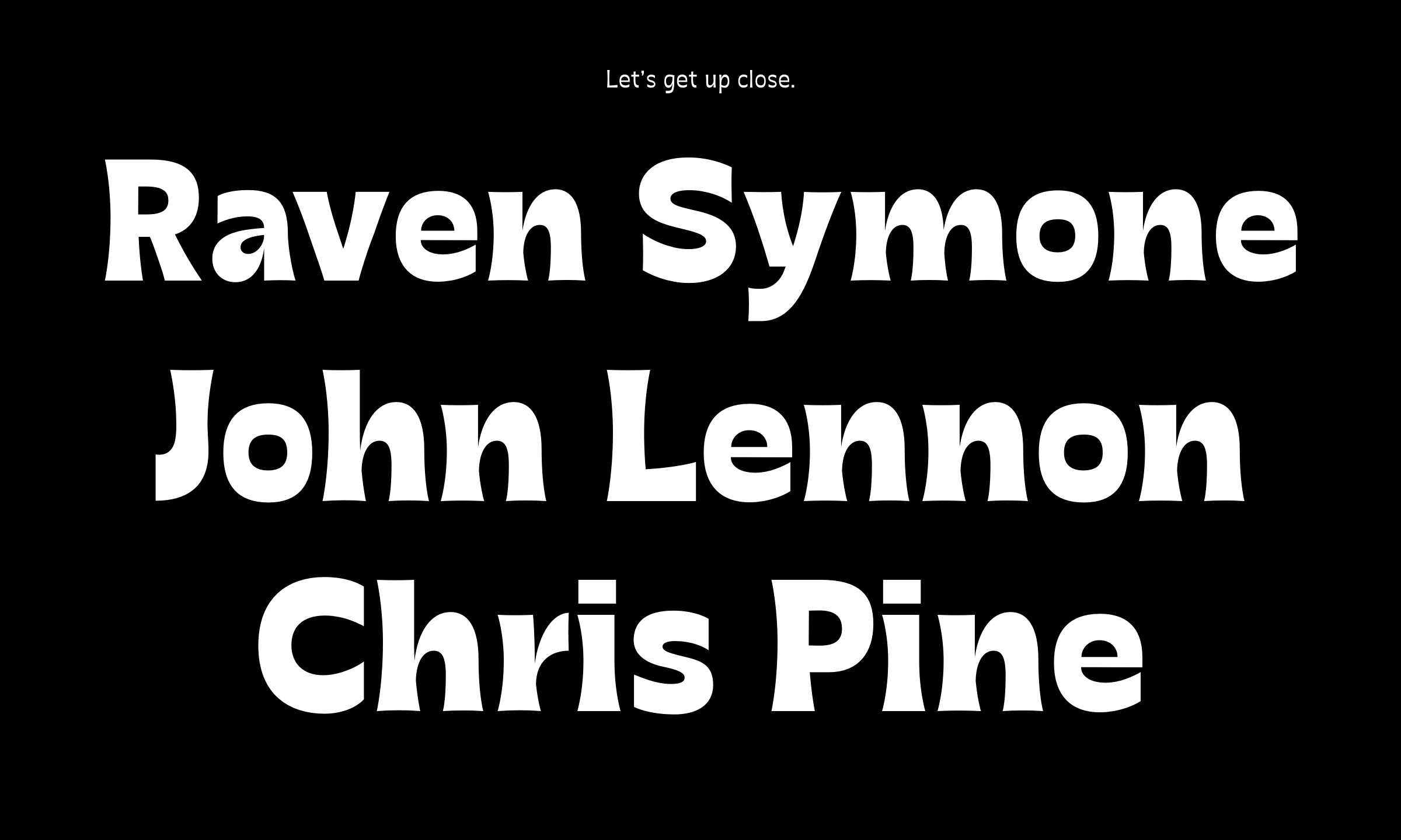
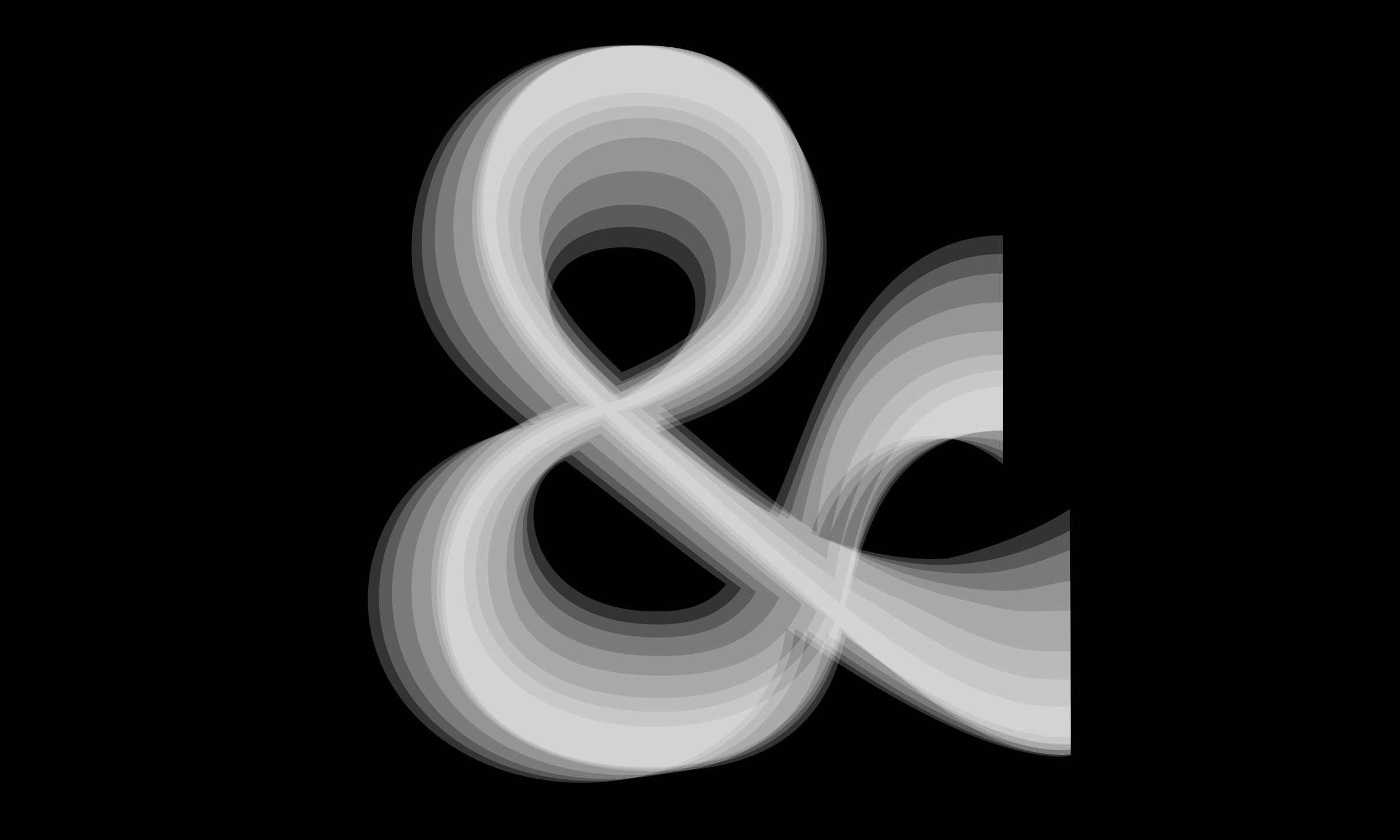
OverviewFreakish is a display typeface with a taste for the peculiar. Flared stems, sharp terminals, and swelling curves give familiar letterforms an unexpected edge. Across its weight range, delicate, wiry strokes grow into dense, muscular shapes, carrying the same eccentric personality from Razor to Black. Alternate letterforms offer further room for expression, making Freakish a lively choice for identities, headlines, and editorial typography.
Developed as the final project for completion of the Certificate in Type Design at Letterform Archive in San Francisco, under the guidance of James Edmondson of OH no Type Co.